Building a Rock Solid Auto Grid

In this article, I'm sharing a customizable CSS auto-grid layout. It's a grid component that allows for adjustments in minimum column widths, horizontal and vertical gaps, and even the maximum number of columns to fit various design needs.
Since CSS Grid Layout became supported by all major browsers back in late 2017, it has opened up a lot of possibilities for designing web layouts. However, I've noticed that many new developers still find it challenging to grasp. I totally get it; it took me a while to get the hang of using new concepts like repeat(), minmax(), and fr myself. So, I thought it would be helpful to share a simple auto-grid component that we frequently use in our web development projects at 9elements.
The HTML setup for this is pretty straightforward. We start with a div that has the class auto-grid and attach a list of items to it. Our demo items don't contain any content, so we'll add a background color and a fixed height to them. This way, you'll be able to see them.
See the Pen auto-grid 01 by Nils Binder (@enbee81) on CodePen.
Now let’s start setting up our grid:
css.auto-grid {
	display: grid;
	grid-template-columns: 1fr 1fr 1fr;
	gap: 1rem;
}
By setting display: grid;, we're telling the container to act as a grid. Then, we're defining our columns. With grid-template-columns: 1fr 1fr 1fr;, we're creating three columns of equal width. The fr unit stands for "fraction" and represents a share of the available space. And we add a gap of 1rem, that makes it a lot easier to see the columns.
No one enjoys writing the same code over and over again. Luckily, CSS Grid offers a handy shortcut. Instead of listing 1fr three times, you can use repeat(3, 1fr). This way, if you ever need to change the number of columns, you can simply adjust the number in the repeat function.
Get started with auto-fit
Up until now, our focus was on the number of columns, without considering their width. To specify a fixed width, we can replace the fr unit with a fixed measurement. Furthermore, instead of defining a set number of columns, we can use the auto-fit keyword. This allows us to create as many columns as can fit within the parent container, adjusting dynamically to the available space.
css.auto-grid {
	display: grid;
	grid-template-columns: repeat(auto-fit, 10rem);
	gap: 1rem;
}
See the Pen auto-grid 02 by Nils Binder (@enbee81) on CodePen.
This approach works well, but often, you might not want your grid items fixed at exactly 10rem. Instead, you'd prefer a minimum size of 10rem, with the ability for items to expand if additional space is available. This can be achieved by combining a fixed size with the flexible fr unit inside a minmax() function, which is specifically designed for grid template declarations. We set the minimum width to 10rem and allow the columns to grow with the available space, up to a maximum of 1fr.
css.auto-grid {
	display: grid;
	grid-template-columns: repeat(auto-fit, minmax(10rem, 1fr));
	gap: 1rem;
}
See the Pen auto-grid 03 by Nils Binder (@enbee81) on CodePen.
There's an important aspect we haven't yet covered: what happens if the grid container is smaller than the columns' minimum width. Typically, this would cause an overflow, which is seldom desirable in a layout. To avoid such overflow, we need to ensure that the minimum size specified in the minmax function does not exceed the container's width. This is where the min() function comes in handy. Unlike minmax, min() can be used outside grid template declarations. It compares a set of values and selects the smallest. For instance, min(10rem, 100%) will choose 10rem as long as the container's width exceeds 10rem. When the container's width is less than 10rem, 100% becomes the chosen value, preventing overflow. In our grid setup, this adjustment would look like:
css.auto-grid {
	display: grid;
	grid-template-columns: repeat(auto-fit, minmax(min(10rem, 100%), 1fr));
	gap: 1rem;
}
See the Pen auto-grid 04 by Nils Binder (@enbee81) on CodePen.
Making things customizable with custom properties
To make our auto-grid component more versatile, we'll introduce CSS custom properties (variables). This will allow us to accommodate different use cases more effectively. Since we're about to make the column width declaration more complex (no worries, it'll be clear), our first step is to move the calculation into a variable. This way, we can easily reuse it in our grid template declaration. We'll also create a variable for the minimum column width, with a default value of 10rem. Here's how it looks:
css.auto-grid {
	/* Variable for column width calculation */
	--column-width: min(var(--auto-grid-min-size, 10rem), 100%)

	display: grid;
	/* Apply the calculated column width */
	grid-template-columns: repeat(auto-fit, minmax(var(--column-width), 1fr));
	gap: 1rem;
}
To make our grid's spacing even more customizable, we'll introduce variables for the gap property too. This is where we get to play with some variable fallback magic. The gap property can take two values: one for the vertical gap between rows and another for the horizontal gap between columns. When only one value is given, it applies equally to both vertical and horizontal gaps. We'll define two variables: --auto-grid-gap for the general gap and --auto-grid-gap-vertical for the optional vertical gap. The neat trick here is to use chained fallbacks for the vertical gap, allowing it to default to the general gap value, and then to 1rem if neither is defined. Here’s how we implement this:
css.auto-grid {
	/* Variable for column width calculation */
	--column-width: min(var(--auto-grid-min-size, 10rem), 100%);

	display: grid;
	/* Apply the calculated column width */
	grid-template-columns: repeat(auto-fit, minmax(var(--column-width), 1fr));

	/* gap with fallback */
	gap:
		var(--auto-grid-gap-vertical, var(--auto-grid-gap, 1rem))
    var(--auto-grid-gap, 1rem);
}
See the Pen auto-grid 05 by Nils Binder (@enbee81) on CodePen.
Our auto-grid component is now versatile enough to accommodate about 90% of layout scenarios. It's designed to maximize the use of available space by dynamically adjusting the number of columns within a single row, ensuring a clean, overflow-free display even on smaller screens or within constrained containers. What makes this particularly satisfying is the ability to easily customize and reuse the component across your project, simply by tweaking the custom properties.
Adding a max-column-count
Sometimes I'm asked, "Can we set a limit to the number of columns? I don't want an endless sea of them." The answer is a resounding yes—we can definitely put a cap on column counts. However, a word of caution: as we venture into this territory, be prepared. The CSS gets a bit trickier from here on out.
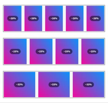
Let's say we aim for a max of four columns. With four columns, we're kind of aiming for each to take about 25% of the width. But, there's a catch—the gaps. They take up some space too, so it's more like 25ish %, not exactly to the dot, unless you set your gaps to zero.
Now, what happens if we tweak the numbers? If we go down to three columns, each one gets a bit more room, about 33% of the space. But if we add an extra, making it five, then each column has to slim down to fit, getting around 20% each.
Next, we need a trick to cap our column widths at about 25%. We're okay with column widths stretching beyond that, say to 33%, but anything less, like 20%, just doesn't cut it. That's where the CSS max() function comes into play. We've seen min() in action, picking the smallest value. Well, max() is its counterpart, always grabbing the largest value from what we give it.
Let's tweak our --columns-width variable in our CSS. We're going to envelop it with a max() function.
css--column-width: max(
	25%, /* This is the 25ish %. We'll look at this in a second */
	min(var(--auto-grid-min-size, 10rem), 100%)
);
This way, if there's space for a fifth column, and each column's width might drop to around 20%, our setup ensures that the columns don't shrink beyond 25% because our max() function prioritizes the larger value, keeping our columns nicely sized.
Mind the gap
To address the gap issue, we can't use a flat 25% because it doesn't account for gaps. Instead, we adjust the desired column width by subtracting the gap width from 25%. This approximation isn't perfect—it subtracts the total gap from the width as if there were gaps for all four columns, not just the three in-between. However, this discrepancy doesn't impact the layout due to the minmax function with 1fr, allowing columns to expand into available space.
For clarity, we'll separate the calculation of the maximum column width into its own variable:
css--max-column-width: 100% / 4 - var(--auto-grid-gap, 1rem);

--column-width: max(
	var(--max-column-width),
	min(var(--auto-grid-min-size, 10rem), 100%)
);
And voila, now the auto-grid will never show more than 4 columns, and will nicely reduce the column-count when the surrounding container get’s smaller.
To infinity and beyond
In our quest to make the max-column-count flexible, we introduce a variable called --auto-grid-max-columns. For those moments when no specific count is provided, our aim is an endless expanse of columns, limited only by the available space. Rather than resorting to an arbitrarily high number like 999 to simulate this effect, CSS allows us to elegantly use the infinity constant within calc() operations. This makes infinity a much cleaner and semantically accurate choice, as dividing by infinity effectively sets the value to 0, perfectly suiting our scenario for an unlimited number of columns. In practice, it looks like this in CSS:
css--max-column-width: 100% / var(--auto-grid-max-columns, infinity) - var(--auto-grid-gap, 1rem);

--column-width: max(
	var(--max-column-width),
	min(var(--auto-grid-min-size, 10rem), 100%)
);
Finally – here you can see everything combined in action.
See the Pen final auto-grid by Nils Binder (@enbee81) on CodePen.
Wrapping up
I hope this guide has made CSS Grid and creating reusable components a bit clearer. What's really cool about this is you don’t have to know everything about it to use it. This means in a big team, anyone can take this component, tweak the settings, and it'll work for their needs. It's all about making things easier and more flexible for everyone involved.