From Hacks to Elegance: Transforming a Card Component with Modern CSS Wizardry

A few years ago, I had to build a card component that looked a little different than the usual cards you find on most websites. It turned out that this card led to one of my biggest estimation errors because I completely underestimated how problematic it would be to implement the layout. Now a few years later, we got the chance to refactor the code, and I took another look at the component to see if I could find a more elegant solution with modern CSS.
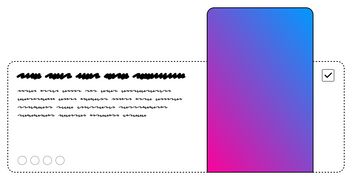
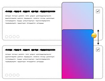
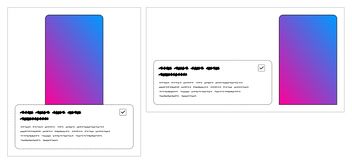
Now, let me explain what makes this card so unique. The main challenge lies in handling the image. As you may have guessed, the card displays app mockups inside a phone frame. But here's the twist: the image isn't confined within the card's boundaries. Depending on the amount of text, it can extend beyond the upper border of the card. Another requirement is that the image's height can vary or be absent entirely. So, the card should work seamlessly even without the image.
Failed Attempts
The Absolute Positioning Dilemma
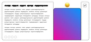
One approach was to position the image using position: absolute. In doing so, we would need to ensure that there is always sufficient space for it by setting appropriate padding. However, a problem arises with this method: the image can easily overlap the previous DOM elements since the image is removed from the normal flow and does not take up space.
Three column Grid
I also experimented with a three-column grid layout. This arrangement works well when the image is larger than the content. However, as soon as the content becomes lengthier, a noticeable issue arises. You realize that the box behind the phone is not a cohesive element but two separate elements that merely pretend to be connected. Additionally, complications arise when you need a gradient background instead of a solid color. In such cases, you need a single element that spans the entire card to achieve the desired effect.
The Winning Approach: A Flexbox-Twist
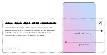
In the end, what proved successful for me was placing the elements beside each other within a flex container. By combining a negative margin with an equal amount of padding on the text element, I made it stretch behind the image. Although this approach works, it still feels somewhat like a workaround, and calculating the necessary margin and padding values can become quite tricky. You need good documentation so it doesn’t look like magic numbers.
It's important to note that this was a few years ago when features like custom properties, cascade layers, and subgrid were not yet available. So now, let's explore how we can build the same functionality using some exciting new CSS features that have emerged in the past two years.
My 2023 Approach
Basic Markup
Let's start with the markup structure for the card, which we'll refer to as phone-card:
html<article class="phone-card">
<div class="phone-card__visual">
<div class="phone-mockup"><img src="https://placehold.co/220x360" alt=""></div>
</div>
<div class="phone-card__body">
<div class="phone-card__copy">
<h2>Some text goes here</h2>
<p>Lorem ipsum ...</p>
</div>
<div class="phone-card__action">
<label for="myCheckbox01" aria-label="Select box 01">
<input type="checkbox" class="custom-check" id="myCheckbox01">
</label>
</div>
</div>
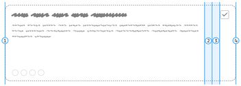
</article>My goal is to utilize this component primarily as a layout component, enabling me to insert different components into the designated layout slots. In this case, we have two slots: one for the visual and another for the body content. Within the body section, we find two additional slots named 'copy' and 'action.' Consequently, the entire card consists of three distinct parts: the visual, copy, and action.
I still use the BEM (Block-Element-Modifier) naming convention for my class names. This way, you can easily see, that phone-card__visual belongs to the phone-card itself, while phone-mockup is an independent component.
Organizing with CSS Cascade Layers
CSS Cascade Layers provide a fantastic solution for organizing CSS code while avoiding the complexities of specificity. When I'm diving into new experiments, I frequently turn to CodePen as my go-to platform. Until recently, I often relied on one of the predefined reset options like normalize or reset. However, I didn't always find them completely satisfying. On the other hand, I choose not to include my own reset styles at the top of my CSS because, more often than not, there isn't anything interesting happening in that section.
With layers, I can place my reset styles at the bottom of the code without worrying about conflicts, thanks to the layer order I define at the top using @layer reset, components, utilities;. This means that even styles not assigned to a specific layer will still have higher specificity than anything defined in the reset layer regardless of their position in the code.
I also included a utilities layer with two utilities: a basic max-width wrapper and a sr-only class for hiding text from view while ensuring accessibility to screen readers.
See the Pen phone-card 01 - Markup + CSS Reset by Nils Binder (@enbee81) on CodePen.
If you want to dive deeper into how the cascade works I recommend this talk by Bramus van Damme. To fully harness the potential of CSS layers, you may need to adjust your CSS writing approach. Manuel Matuzović has written an insightful post with valuable insights and recommendations on this topic.
Note: Cascade Layers is the only new feature in this post that doesn't have a graceful fallback. If you choose to use layers, it's important to ensure that your users are have access to browsers that support this feature. Also, keep in mind that some older smartphones may not be capable of receiving updates, which means users may be stuck with older browser versions.
Grid Setup and Custom Properties
Now that our style reset is in place, we can start styling the component. For the basic mobile layout, we utilize a two-row grid. The visual element is centered in the first row, while the second row is dedicated to the body content. To position the children within the body section, we use a two column grid.
css@layer components {
  .phone-card {
    display: grid;
    grid-template-rows: auto auto;

    &__visual {
      justify-self: center;
    }

    &__body {
      display: grid;
      grid-template-columns: auto auto;
    }
  }
}
To ensure reusability, I use variables to style the background, padding, and border-radius of the body in this component. A common convention that has emerged is to prefix internal variables with an underscore, while variables accessible to users omit this prefix. This approach has another great advantage: you only need to define a fallback value once, saving you from repeating it every time you use the variable. If you want to learn more about this, I highly recommend watching Lea Verou's talk on 'CSS Variable Secrets'.
css@layer components {
  .phone-card {
    // --phone-card-padding can be used to modify the padding.
    // If it is not set, the fallback value (1.5rem) will be used instead
    --_phone-card-padding: var(--phone-card-padding, 1.5rem);
    --_phone-card-radius: var(--phone-card-radius, 1rem);
    --_phone-card-background: var(--phone-card-background, rgb(0 0 0 / 0.1));

    display: grid;
    grid-template-rows: auto auto;

    &__visual {
      justify-self: center;
    }

    &__body {
      display: grid;
      grid-template-columns: auto auto;
      // No fallback value is needed here, because it is already set at the top
      gap: 0 var(--_phone-card-padding);
      padding: var(--_phone-card-padding);
      background: var(--_phone-card-background);
      border-radius: var(--_phone-card-radius);
    }
  }
}
See the Pen phone-card 02 - Grid setup & body styling by Nils Binder (@enbee81) on CodePen.
Responsive View with Container Queries
The component will be used in different contexts, and I won't always have prior knowledge of the container's width. Therefore, container queries offer a great solution for altering the layout when sufficient space is available. It's important to note that container queries don't allow direct attribute changes to the container itself. Because of that, we often need to wrap the component inside an additional DOM element. In this case, a simple <div> will suffice, but it could also be an <li> if you're working with a list of articles.
html<div class="phone-card-container">
  <article class="phone-card">
    <div class="phone-card__visual">
      ...
    </div>
    <div class="phone-card__body">
      ...
    </div>
  </article>
</div>
In our CSS we need to define the container by specifying an optional container name and a container type. In our case, we'll use the name phone-card and set the container type as inline-size. By doing this, the container's intrinsic sizing is removed, allowing us to query its width (referred to as the inline size). For more in-depth insights on this topic, I recommend watching Miriam Suzanne's talk titled 'Intrinsic CSS with Container Queries & Units'.
css@layer components {
  .phone-card-container {
    container: phone-card / inline-size;
  }
}
With the container set up, we can now focus on adjusting the layout for larger widths. Since achieving an image placement 'inside' the box can be challenging, we'll start with a simpler approach and gradually enhance it. Initially, we'll switch from a two-row to a two-column layout, placing the visual element in the second column. This repositioning ensures that the visual element is no longer on top of the body but aligned next to it. To ensure everything lines up at the bottom, we'll add align-items: end to the styling.
css.phone-card {
  ...

  @container phone-card (width > 42rem) {
    grid-template-rows: auto;
    grid-template-columns: auto auto;
    align-items: end;
    gap: 0 var(--_phone-card-padding);

    &__visual {
      grid-column: 2;
			grid-row: 1;
    }

    &__body {
      grid-row: 1;
    }
  }
}
See the Pen phone-card 03 - Container Query by Nils Binder (@enbee81) on CodePen.
Say hello to subgrid
So far, we have a simple layout consisting of a text box positioned next to an image. Now, let's explore how we can effectively position the image between the checkbox and the text. This is where subgrid comes into play. Subgrid, which has been available in Firefox since Version 71 and recently arrived in Safari (Version 16.0), will soon be accessible in Chrome (117) as well. By utilizing subgrid, we gain access to the parent element's grid template definitions. This allows us to place the children of the phone-card__body into the grid columns defined on the phone-card itself.
As this feature is relatively new, we'll use a feature query to check for subgrid availability. It looks like this: @supports (grid-template-columns: subgrid) { ... }. Once we’re sure that subgrid is supported, we can modify the grid-template-columns attribute of thephone-card__body. Instead of using auto auto, we'll use subgrid as the value. Now we can stretch the body across three columns, placing the action in the third column, while the visual remains in the second column. The phone-card__copy automatically places itself in the first column.
css.phone-card {
  ...

  @container phone-card (width > 42rem) {
    ...
    @supports (grid-template-columns: subgrid) {
      &__body {
        grid-template-columns: subgrid;
        grid-column: 1 / 4;
      }

      &__visual {
        z-index: 2;
      }

      &__action {
        grid-column: 3;
      }
    }
  }
}
You may notice that the visual element is slightly bumped up on the z-index. This is because it appears earlier in the DOM; otherwise, the visual would appear behind the body.
See the Pen phone-card 04 - Subgrid by Nils Binder (@enbee81) on CodePen.
Mind the gap - conditional styling
We're almost there, just one more thing to address. Going back to the beginning, you might recall that one of the requirements for this component is that the image should be optional. If you try deleting the visual element in our current version, you'll notice that it still looks quite good. However, there's one thing to keep in mind. Since we make the body span over three columns in the grid, even without the visual occupying the second column, there will be a gap created. In fact, there will be two gaps due to the presence of three columns in the grid.
To be honest, in most cases, I wouldn't be too concerned about it. Even without the visual element, I would typically set a max-width for the copy, so whether there's one gap or two wouldn't make much of a difference. However, if you wish to eliminate the gap, one approach would be to utilize the :has selector. By checking if the visual element is NOT present, we can adjust our CSS accordingly. While we're at it, we can also implement a min-height for the body when the visual element is present:
css.phone-card {
  ...

  @container phone-card (width > 42rem) {
    ...

    &:has(.phone-card__visual) {
      .phone-card__body {
        min-height: 19rem;
      }
    }
    @supports (grid-template-columns: subgrid) {
      ...

      &:not(:has(.phone-card__visual)) {
        .phone-card__body {
          grid-column: 1 / 3;
        }

        .phone-card__action {
          grid-column: 2;
        }
      }
    }
  }
}
See the Pen phone-card 05 - conditional styling by Nils Binder (@enbee81) on CodePen.
Currently (as of July 2023), Safari is the only browser that fully supports all the features used to build this component. Firefox doesn't support the :has selector, and subgrid is not yet supported in Chrome. However, even without these features, the card still maintains a visually pleasing appearance. The best part is that we don't have to make any changes to the code. As soon as browsers support these new features, the layout will be further enhanced automatically.
Polished version
You might already have guessed, that the real design wasn’t just gray boxes on white background. To give you an idea on how this component could look I made a version that is a bit more polished. This includes:
- Phone-mockup around the image
- Gradient background for the body element
- Added the four little dots at the bottom
- Minimal styling for the checkbox
- …
See the Pen phone-card final by Nils Binder (@enbee81) on CodePen.
Conclusion
To wrap it up, what seemed like a straightforward card component turned out to be a real puzzle to solve. Looks can be deceiving, and even seemingly simple designs can hide complex challenges.
However, amidst the obstacles, we discovered the sheer power of modern CSS features. By embracing techniques like CSS Cascade Layers, container queries, custom properties, and subgrid, we were able to unlock a whole new world of possibilities. These tools allow us to create more elegant and responsive solutions for our card component.
By combining progressive enhancement principles with the cutting-edge features available today, we can push the boundaries of web design and deliver exceptional user experiences. So, let's keep exploring, experimenting, and harnessing the full potential of CSS innovation to create stunning components and layouts that leave a lasting impact on our users.