Visualizing global health data on data.who.int
For the past three years, 9elements has worked collaboratively with UK agency Kore, helping the World Health Organization (WHO) to visualize global public health data on data.who.int, WHO’s central data hub.
Open health data plays a key role for guiding public health decisions and informing the general public. The data needs to be presented and visualized well so health professionals, scientists, policymakers and citizens can access, understand and use it.
The WHO Data portal, launched in May 2023, is a joint effort of public health professionals, data scientists, visualization experts, UX designers, accessibility specialists and software developers.
Under the project leadership of Kore, 9elements developed a central piece of data.who.int, the tailor-made data visualization framework. This work needs to meet the highest quality standards. The WHO principles require the content to be accessible to everyone, everywhere in the world.
Data Design Language
Our work is based on the WHO Data Design Language, produced by Kore and conceived by a diverse team led by the world-renowned data visualization designer Moritz Stefaner. The core design values are:
Clear: Data presentations are tailored to information needs, understandable and approachable.
Open: Data presentations are accessible by following the Web Content Accessibility Guidelines (WCAG). They are international, available in the six official WHO languages.
Robust: Using solid and lean technologies, the data is presented in a variety of channels and sizes. The presentations have alternative access modes, adapt to user preferences and reading situations.
Transparent: The data presentations reveal uncertainty, precision, provenance and coverage of the data.
Comparing countries on powerful dashboards
The data visualization framework features several pages:
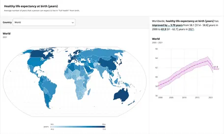
Indicator pages like Healthy life expectancy at birth (HALE) allow to compare countries and regions and break down the data by sex and age group, for example.
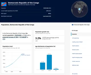
Country pages like the Democratic Republic of the Congo give an overview of the public health in one country by showing key health statistics like demographics, life expectancy and causes of death.
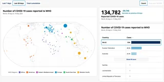
The COVID-19 dashboard tracks cases, deaths, vaccinations and current variant circulation.
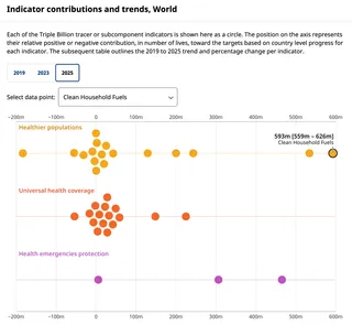
The Triple Billion progress dashboard tracks the world’s progress towards improving the lives of people through access to universal health coverage, protection from health emergencies and through better health and well-being.
Tailor-made data visualization framework
While there are several mature data visualization kits, there was no solution that met WHO’s strict requirements and integrated well with their data infrastructure.
We developed a tailor-made, light-weight data visualization framework for public health data on a world scale. To deliver data experiences with the highest quality, it implements the clear vision and guidelines of the Data Design Language.
The visualization framework is both extensible and flexible. It produces interactive data experiences in the browser, but also text, static HTML and SVG and pixel-based images. The goal is to serve the most robust data presentation suitable for the medium, the reading context and the client capabilities.
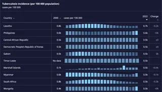
The framework connects the WHO databases to combine data with metadata, translations, and formatting rules to present the data in a meaningful way and to put it into perspective.
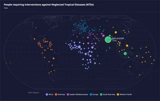
Individual facts, tables and charts are combined into interactive widgets to make complex datasets accessible. These widgets compare the data across time, geographical and political entities, like countries and regions, as well as categories, like sex and age group.
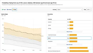
We built a chart creator where WHO content editors can explore the data and be guided to help them build a suitable visualization. For data curators, we have built a powerful data explorer for more than 2,000 indicators.
Under the hood, the visualization framework is implemented in portable JavaScript code that runs in the browser, in Node.js, and in cloud functions. The individual charts and widgets are implemented in D3 and Svelte, a well-established duo that produces lean HTML, CSS, SVG and fast JavaScript.
Building your next data visualizations
At 9elements, we have been visualizing data for our clients for more than 10 years. In 2013, we developed GED VIZ for the Bertelsmann Foundation, visualizing global economic relations. From 2014 on, we developed the front-end and the chart rendering of the OECD Data Portal. In 2015, we contributed to the World Economic Forum Inclusive Growth Report.
Let us discuss how we can help you to explore, present and visualize the data of your organization or business! Contact us.
Credits
This project was developed for Kore, an agency for positive public impact through strategy, design and information architecture, based in the UK. With thanks to their wider team, below, on this work for WHO.
Data visualization, product design, UX/UI, cartography and accessibility: Alice Thudt, Christian Laesser, Fred Wheeler, Maarten Lambrechts, Matt Hollidge, Moritz Stefaner, Philippe Rivière, Sarah Fossheim and Yaseed Chaumoo.
Thanks to all WHO staff involved with the project.
