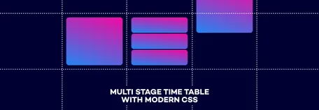
Building a multi stage timetable with modern CSS using grid, subgrid, round(), and mod().
Timetables are one of those components that look simple but contain a surprising amount of layout logic. For a project in 2026 I needed a version that supports multiple stages, adapts to the tallest session, and stays aligned across the entire timeline — all built in CSS.
Since the post is fairly long, here’s a brief overview of what’s coming:
Building the grid and placing the sessions — using subgrid, mod(), and round() to map times to grid lines.
Adding hour indicators — adding visual markers and handling horizontal overflow.
Sticky session headlines with scroll-driven animations — making the stage headers follow the scroll position.
Before diving in, here is the final result. This is what we’re building.
See the Pen Timetable | 03b by Nils Binder (@enbee81) on CodePen.
Part I: Building the grid and placing the sessions
Setting up the basic HTML
One of my main goals was to write clear, readable markup that defines each stage and its sessions. I also wanted a simple and intuitive way to assign a start and end time to every session. Here’s the base structure I ended up with:
html<div class="timetable">
  <div class="timetable--body">
    <div class="stage" style="--column: 2;">
      <h2 class="stage-headline">Main Stage</h2>
      <ol class="session-list" role="list">
        <li class="session">
          <!-- Any content for your session card goes here -->
        </li>

        <!-- Add more sessions below -->
      </ol>
    </div>

    <div class="stage" style="--column: 3;">
      <!-- Second stage -->
    </div>
  </div>
</div>
Let's break it down. We have a wrapper for the entire timetable, and a second wrapper for its body. The .timetable--body element isn’t strictly necessary yet, but will become useful later. Each stage gets its own container, marked with a headline and an ordered list holding all sessions for that stage.
Note: You may have noticed the inline styles that define which column each stage belongs to. This will be used later when placing the stages on the grid. I could have done this with pure CSS, but since the layout is already fairly complex, I decided it’s clearer and easier to understand when kept directly in the markup.
To assign time slots to each session, we can use custom properties directly on the <li> elements as inline styles:
html<li class="session" style="--start: 900; --end: 945;">
  <!-- Represents 9:00 - 9:45 -->
</li>
<li class="session" style="--start: 1015; --end: 1120;">
  <!-- Represents 10:15 - 11:20 -->
</li>
<li class="session" style="--start: 1400; --end: 1500;">
  <!-- Represents 14:00 - 15:00 -->
  <!-- am/pm 2pm - 3pm -->
</li>
Note: I’m European, so I’ll be using the 24-hour clock. Even if you prefer AM/PM, the --start and --end values need to stay in 24-hour format behind the scenes—otherwise the math gets messy.
Setting up base CSS
Basic variables
Now let's look at the CSS. For a component like this, I like to define a few useful variables up front:
css.timetable {
  --zebra-color-one: #224;
  --zebra-color-two: #003;

  --time-unit-height: 0.5rem;
  --stages: 2;
  --stage-gap: 1.5rem;
  --stage-width: min(100vw - 3rem, 22rem);

  --start-time: 9;
  --end-time: 18;
  --event-duration: calc(var(--end-time) - var(--start-time) + 1);
}
There’s already quite a bit going on here, so let’s break it down step by step.
We start simple: two color variables that we’ll reuse later.
Next is --time-unit-height, which is where things get more interesting. My timetable supports sessions that can start at 5-minute increments. That means one hour contains 12 possible slots. --time-unit-height defines the minimal visual height of one of those 5-minute units.
Increasing it makes every hour taller and gives more room for precise alignment, but it also means you’ll see more blank space during breaks or empty hours (like a long lunch slot).
Then we have --stages. I’m assuming you already know how many stages your event uses, and since this affects layout calculations, we store that as a variable.
Along with the number of stages, we define a gap between them (--stage-gap) and a consistent --stage-width. In this example, each stage should ideally be 22rem wide, but if that doesn’t fit, the layout will shrink to 100vw - 3rem.
We also store the --start-time and --end-time. Using both values, we calculate --event-duration, which gives us the total number of hours in our timeline. I’m adding one extra hour here purely for visual spacing — not for math accuracy, but for layout aesthetics.
Note: Most likely, you’ll be pulling your timetable data from an external source. When generating the HTML, you might not have access to the CSS files at build time. In that case, you can inject the number of stages, along with the start and end time, as inline styles on the .timetable element instead.
Grid definitions
Now we can use the variables we defined earlier to build the grid for our timetable:
css.timetable {
  /* ... */
  --rows: auto repeat(calc(var(--event-duration) * 12), minmax(var(--time-unit-height), auto));
  --columns: 1rem repeat(var(--stages), minmax(var(--stage-width), 1fr)) 1rem;
}
Rows: We start with an auto-width row at the top — this is where the stage headlines will appear. Below that, we add 12 rows for every hour (var(--event-duration) * 12), because we’re using 5-minute increments.
Each of those rows uses minmax(var(--time-unit-height), auto), which means:
It has a minimum height defined by
--time-unit-heightbut can grow if the session content needs more space
Columns: For the columns, we create one column per stage using repeat(var(--stages), ...). Each stage column has a minimum width defined by --stage-width, but can expand up to 1fr if there is extra room. For purely visual reasons, I also added a 1rem column at the beginning and the end. Later, we’ll place the hour indicators inside these outer columns.
Making use of grid and subgrid
To make sure every hour automatically grows to match the tallest session on any stage, all stages need to rely on the same underlying grid structure. We apply this to the .timetable--body element using the variables we defined earlier for columns, rows, and gaps.
Each stage then reuses that grid by setting grid-template-rows: subgrid.
A common mistake here is forgetting that a stage must span all rows before it can inherit them. To fix that, we set grid-row: 1 / -1, which makes each stage stretch from the top to the bottom of the timetable.
It doesn’t stop there: each session list also needs to use the same grid defined on .timetable--body. Because the session list sits right after the stage headline, it starts on the second row and continues all the way to the bottom (grid-row: 2 / -1).
css.timetable--body {
  display: grid;
  gap: 0 var(--stage-gap);
  grid-template-rows: var(--rows);
  grid-template-columns: var(--columns);
}

.stage {
  display: grid;
  grid-column: var(--column);
  grid-row: 1 / -1;
  grid-template-rows: subgrid;
}

.session-list {
  list-style-type: none;
  grid-row: 2 / -1;
  grid-column: 1;
  display: grid;
  grid-template-rows: subgrid;
} 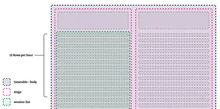
A little adjustment is missing here for smaller screen sizes. We want to be able to scroll though the timetable horizontally, so we add two lines of CSS to our .timeline--body:
css.timeline--body {
  max-width: 100%;
  overflow-x: auto;

  /* ... */
}
Placing the sessions onto the grid using round() and mod()
Now comes the trickiest part of the whole setup. To place each session in the correct position on the grid, we need to convert the time (stored as a number like 1045) into minutes. Remember, every session stores its start and end time as inline custom properties:
html<li class="session" style="--start: 1045; --end: 1120;">Step 1: Convert hours to minutes
First, we extract the hour portion of the number. We divide by 100: 1045 / 100 = 10.45
Now we only want the full hours, so we round the number down: round(down, 10.45, 1) = 10
Then we multiply that by 60 to get the number of minutes:
css.session {
  --start-hours-to-minutes: calc(round(down, var(--start) / 100, 1) * 60);
}
Step 2: Extract the remaining minutes
We still need the minutes portion (45 in 1045).
To do that, we use mod(), which returns the remainder of a division.
By taking mod(var(--start), 100), we get the last two digits of the number:
css.session {
  --start-minutes: mod(var(--start), 100);
}
Step 3: Remove minutes before the timetable starts
Next, we need to subtract all the minutes that happened before the timetable begins. For example, if the event starts at 09:00, we don’t want to count the minutes from midnight to 09:00.
We calculate those minutes like this:
css.session {
  --timetable-offset: calc(var(--start-time) * 60);
}
Step 4: Converting minutes to grid lines
Now we have everything we need to place a session on the grid.
We combine the minutes from the hour portion and the minute remainder (--start-hours-to-minutes + --start-minutes), then subtract the offset (--timetable-offset) so we only count the minutes within the visible timetable.
Since each grid row represents a 5-minute interval, we divide the result by 5.
CSS grid lines start at 1, so we add + 1 to shift the result by one line — otherwise, the first session would end up at line 0.
css.session {
  grid-row-start: calc(
    (var(--start-hours-to-minutes) + var(--start-minutes) - var(--timetable-offset)) / 5 + 1
  );
}
We need the same calculation for the end time, so the session knows where to stop. Putting it all together:
css.session {
  --timetable-offset: calc(var(--start-time) * 60);

  --start-hours-to-minutes: calc(round(down, var(--start) / 100, 1) * 60);
  --start-minutes: mod(var(--start), 100);
  --end-hours-to-minutes: calc(round(down, var(--end) / 100, 1) * 60);
  --end-minutes: mod(var(--end), 100);

  grid-row-start: calc(
    (var(--start-hours-to-minutes) + var(--start-minutes) - var(--timetable-offset)) / 5 + 1
  );
  grid-row-end: calc(
    (var(--end-hours-to-minutes) + var(--end-minutes) - var(--timetable-offset)) / 5 + 1
  );
}
With this in place, we already get a timetable that adapts its height to the content. Notice how the slot between 10:00 and 11:00 becomes much taller than the empty hour around noon during the lunch break.
See the Pen Timetable | 01 by Nils Binder (@enbee81) on CodePen.
Note: There’s also some extra styling for the session cards and the stage headlines. That’s not really part of this tutorial, so you can style those however you like.
Part II: Adding sticky hour indicators
Step 1: Adding hour indicators to the HTML and placing them on the grid
Although all sessions are already aligned correctly, it’s still hard to see when they start. To make this easier, we can add hour indicators that mark the beginning of each hour.
CSS grid does not provide a way to style a single grid row directly, the way we can with table rows in HTML. So we need to add our own elements to the markup. In this case, the hour markers are placed as the first child of .timetable--body, before the first stage:
html<div class="hours" aria-hidden="true">
  <div>
    <time datetime="09:00">09:00</time>
  </div>
  <div>
    <time datetime="10:00">10:00</time>
  </div>
  <div>
    <time datetime="11:00">11:00</time>
  </div>
  <!-- ... -->
</div>
We also need a small update to the CSS. Remember the first “empty” column we added in the column definition? Now we turn it into a defined width column that will contain the hour indicators. We add a new variable and use it in the grid definition:
css.timetable {
  /* ... */
  --th-width: 3.5rem;
  --columns: var(--th-width) repeat(var(--stages), minmax(var(--stage-width), 1fr)) 1rem;
}
Next, we need to place the hour indicators on the grid and make sure they use the same row and column setup as the rest of the timetable. Each direct child of .hours should span 12 rows, which represents exactly one hour in our layout.
This is also where the two zebra colors from the beginning come into play. By alternating the background on every second child, we get a subtle zebra pattern that makes it much easier to see where each hour begins and ends.
css.hours {
  --background: var(--zebra-color-one);
  display: grid;
  grid-row: 2 / -1;
  grid-column: 1 / -1;
  grid-template-rows: subgrid;

  > div {
    grid-row-end: span 12;
    background: var(--background);

    &:nth-child(odd) {
      --background: var(--zebra-color-two);
    }
  }
}
With this in place, the timeline becomes much easier to read.
See the Pen Timetable | 02a by Nils Binder (@enbee81) on CodePen.
Step 2: Making the hour indicators sticky
You may have noticed that the last example includes a third stage. On smaller screens this creates horizontal overflow, and because we set overflow-x: auto on .timetable--body, users can scroll sideways to reveal all stages.
However, when scrolling horizontally, the hour indicators disappear off the screen. To fix this, we keep each <div> as it is (because it controls the zebra stripes), but make the <time> elements themselves sticky:
css.timetable {
  /* ... */
  --th-width: 3.5rem;
  --stage-width: min(100vw - var(--th-width) - 3rem, 22rem);
}

.hours {
  time {
    display: block;
    position: sticky;
    inset-inline-start: 0;
    width: var(--th-width);
    height: 100%;
    background: rgb(from var(--background) r g b / 0.95);
    z-index: 2;
  }
 }
Here's what is happening here:
Since the hour indicators stay visible on the left, we subtract their width from the maximum width of each stage. That’s handled in the
--stage-widthvariable on.timetable.<time> elements are inline by default, so we set display: block
position: stickywithinset-inline-start: 0keeps them visible on the left when scrollingthe width matches the first column, and the height covers the full hour
we reuse the zebra background, but make it slightly transparent
and finally, because the hour indicators are the first elements inside
.timetable--body, a z-index ensures they stay in front of the sessions
See the Pen Timetable | 02b by Nils Binder (@enbee81) on CodePen.
Step 3: Let each stage snap while scrolling
We already have horizontal overflow in place. Now it would be nice if each stage snapped into position so it rests neatly next to the hour indicators when scrolling. This only takes a few lines of CSS:
css.timetable--body {
  /* ... */
  scroll-snap-type: x mandatory;
}

.stage {
  /* ... */
  scroll-snap-align: start;
  scroll-margin-inline-start: calc(var(--th-width) + 0.5rem);
}
See the Pen Timetable | 02b by Nils Binder (@enbee81) on CodePen.
Part III: Sticky session headlines with scroll driven animations
This part is a bit hacky. I want the section headlines to be sticky, similar to the hour labels. But the timetable scrolls on the inline axis, and position: sticky only works within the element’s own scrolling container. When you scroll vertically (the block axis), the page (html) is the scroller, so you can’t pin something to the top if it lives inside a different scrolling context.
One workaround is to constrain the height of the timetable body so it becomes the vertical scroller as well. Then you’d scroll the timetable in both directions, and the headlines could stick to the top. In practice, though, a large two-axis scroll region can feel awkward — it’s not always obvious which container is scrolling. But see for yourself:
See the Pen Timetable | 02c by Nils Binder (@enbee81) on CodePen.
Scroll driven animations to the rescue
One way to solve this is to add a set of “fake” headlines before the actual timetable body. Since they’re duplicates of the real headlines, we mark them with aria-hidden="true"so they’re ignored by screen readers.
html<div class="timetable">
  <div class="timetable--head" aria-hidden="true">
    <div class="timetable--inner-head">
      <div class="stage-headline">Main Stage</div>
      <div class="stage-headline">Masterclasses</div>
      <div class="stage-headline">Startup Stage</div>
    </div>
  </div>

  <div class="timetable--body">
    /* ... */
  </div>
</div>
The entire .timetable--head sits before .timetable--body, which is the scrolling element. Because its parent scroller is still the root (html) element, these headlines can stick to the top of the page.
Let's add a bit of CSS to style them:
css.timetable--head {
  display: none;
  position: sticky;
  pointer-events: none;
  top: 0;
  z-index: 5;

  @supports (animation-timeline: --scroll-x) {
    display: block;
  }
}

.timetable--inner-head {
  display: grid;
  gap: 0 var(--stage-gap);
  grid-template-columns: var(--columns);

  background: var(--zebra-color-one);
  color: #fff;
  position: absolute;
  inset-inline-start: 0;
  inset-block-start: 0;
  min-width: 100%;
  box-shadow: 0 1px 0 rgb(255 255 255 / 0.2);

  > :first-child {
    grid-column: 2;
  }
}
For the .timetable--head, you can see that it’s hidden by default. The whole setup relies on animation-timeline, which isn’t supported in all browsers, so we only show the element when support is detected. We also set pointer-events: none because this is just a visual placeholder that mimics the real headline section and shouldn’t block any interaction.
The .timetable--head itself uses position: sticky so it stays fixed at the top of the page while scrolling.
In the .timetable--inner-head, we repeat the grid definitions from .timetable--body. Because the values are stored in variables, we can just reuse them here. While we used subgrid in the body to share the grid structure, the head exists in its own context, so it needs its own grid definition here.
See the Pen Timetable | 03a by Nils Binder (@enbee81) on CodePen.
Now the headlines are sticky, but on smaller screens they still don’t move along the inline axis, because they’re not part of the scrolling container. This is where scroll-driven animations come in.
The idea is:
we create a named scroll timeline on
.timetable--body, so other elements can react to its scroll positionbecause
.timetable--headis not a child of.timetable--body, we extend the timeline’s scope on the surrounding.timetablecontainer using timeline-scopewith that in place, we animate
.timetable--inner-headso its horizontal position follows the scroll progress of.timetable--body
Here’s the CSS for that:
css.timetable {
  /* ... */

  /* Allow descendants to use the named scroll timeline */
  timeline-scope: --scroll-x;
}

.timetable--inner-head {
  /* ... */

  /* Apply the animation */
  animation: slide linear both;
  /* Use the named animation timeline */
  animation-timeline: --scroll-x;
}

/* Scroll-driven animation:
   - starts with the left edge aligned to the container’s left
   - ends with the right edge aligned to the container’s right */
@keyframes slide {
  from {
    inset-inline-start: 0;
    transform: translateX(0);
  }
  to {
    inset-inline-start: 100%;
    transform: translateX(-100%);
  }
}

.timeline--body {
  /* ... */

  /* Create a named scroll timeline on the inline axis */
  scroll-timeline-name: --scroll-x;
  scroll-timeline-axis: inline;
}
And that’s it 🎉 — all pieces in place. Here’s the final result:
See the Pen Timetable | 03b by Nils Binder (@enbee81) on CodePen.
Final notes
The functions round() and mod() became part of the CSS Baseline in 2024, and at the time of writing they’re supported by roughly 86% of browsers according to caniuse. For older browsers I’ve added a small JavaScript fallback that calculates the session positions and applies the grid placement inline, so the timetable still works even without full CSS support.
That’s all for this component. I hope the breakdown of the structure, the positioning logic, and the scroll-driven parts is useful if you ever need to build something similar. If you use this for your own timetable, I’d be curious to see the result.

