Building a combined CSS-aspect-ratio-grid

Recently I was faced with the following problem: I had to build a layout that consists of several rows. In each row are two images with a fixed aspect ratio. The two images should have the same height and fill the entire row. The images' aspect ratios vary from 16:9 to 3:4, so there are landscape images and portrait and square images.

Since Safari started to support CSS-aspect-ratio at the end of 2021, it is possible to display a single image with a fixed aspect ratio – so there is no need to use a padding hack anymore. However, this does not help if you have several elements next to each other that should have a fixed combined width and all the same height. So we need another solution.
Let us start by building the markup required for this kind of layout: We need two divs for our example. One should have an aspect ratio of 4:3, and the other is a portrait with an aspect ratio of 2:3.
html<div class="row">
  <div class="item" style="--ratio: 4 / 3;">4:3</div>
  <div class="item" style="--ratio: 2 / 3;">2:3</div>
</div>
See the Pen combined aspect-ratio 01 by Nils Binder (@enbee81) on CodePen.
We set a custom property here via inline style to store the desired ratio. To apply this to the item, we then can use the variable like this: aspect-ratio: var(--ratio);
As you can see, both elements have the same width but have different heights. You may think setting the height to 100% would help here, but it will not change anything because there is no height set for the row. So 100% of nothing is – well, nothing.
Solution #1: Define an aspect ratio for the row
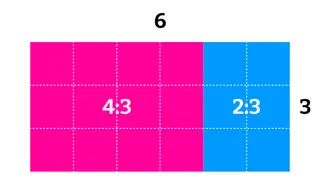
For the first approach, you need to know the aspect ratio of the enclosing rectangle. In our example, both fractions' denominators (the second/lower part of the fraction) are identical. Therefore, it is relatively easy to get the aspect ratio of the combined rectangle by adding both fractions. 4/3 + 2/3 = 6/3.
Knowing this, we can set the aspect ratio on the row element. Then for the items, we don't specify a width and set the height to 100%. So the item's height is defined by the row's height. The item's width is calculated based on its aspect-ratio value:
css.row {
  aspect-ratio: 6/3;
  display: flex;
}

.item {
  aspect-ratio: var(--ratio);
  height: 100%;
}
See the Pen combined aspect-ratio 02 by Nils Binder (@enbee81) on CodePen.
In this example, it is pretty easy to combine the two fractions. But what if one image has a ratio of 16:9 and the other one is 3:2? To calculate the sum of the two fractions, we have to find the lowest common denominator and then add the numerators of the two fractions.
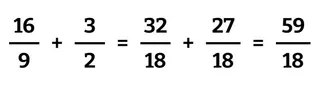
Luckily, you don't have to do the math on your own. Instead, you can hand it over to CSS and put the two fractions inside a calc function:aspect-ratio: calc((16 / 9) + (3 / 2))
This approach also works just fine if you use the image's actual dimensions. So you could have something like this: aspect-ratio: calc((800 / 450) + (600 / 400))
Known caveats
You have to set the aspect ratio on the item itself, as well as on the enclosing container
If you want to add a third element, you have to alter the calculation for the container
Adding a gap between the items will break the layout.
At first, I was pretty happy with the solution. But having to know the number of items and their aspect ratios on the container level really got me frustrated while working with it. So I wanted to find another solution where the container does nothing more but provide a flex environment and set the needed gap property.
Solution #2: Flex-Grow-Magic
Flexbox is the key to this solution here. Instead of setting the width or height of the items, we can tell them how much they are allowed to grow. To be honest, I don't know if I ever used a flex-grow value other than 0, 1, or 999 before. But for this scenario here, flex-grow is precisely what we need.
Let's have a look at our initial example again:
Here you can see that on the horizontal axis, there are six units in
total. Four are taken up by the first item and two by the second one.
Now, if we use these numbers as our flex-grow values, we get exactly
what we want:
css.row {
	display: flex;
	gap: 1rem;
}

.item {
	flex-basis: 0;
	aspect-ratio: var(--ratio);
}

.item:first-child {
	flex-grow: 4;
}

.item:last-child {
	flex-grow: 2;
}
See the Pen combined aspect-ratio 03a by Nils Binder (@enbee81) on CodePen.
To understand why this works, you need to know how flex-grow works: We have a flex-grow value of 4 on one side and one of 2 on the other. Now, whenever 6 units of empty space need to be distributed, 4 go to the first element and 2 to the second. This only works if you set the flex-basis to zero. So that all the available space is distributed according to the flex-grow values. Otherwise, the item's content would define the basis. The good thing here is that you can use any gap value on the parent container. Flex-grow looks at the available space after the gaps are substracted from the total width.
As seen in the first solution, this gets a little trickier when the fractions don't have the same denominators. So let's see how this looks when we use the calculated decimal values instead. For 4/3, we get 1.333… and 2/3 results in 0.666…
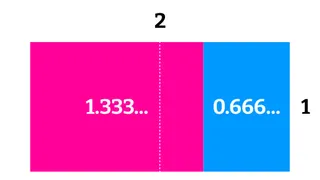
We now have two units on the horizontal axis, with the first item occupying 1.333 parts and the second one taking the remaining 0.666. Using these numbers as flex-grow values, we get the same result as in the previous example when we used 4 and 2.
Knowing this, all we have to do to get everything working the way we want is to set the same value for aspect-ratio and flex-grow. The only difference is that aspect-ratio accepts a fraction, whereas flex-grow needs a decimal value. So we have to calculate the decimal value like this: flex-grow: calc(var(--ratio));
Here you can see the minimal code needed to get this thing working:
css.row {
	display: flex;
	gap: 1rem;
}

.item {
	flex-basis: 0;
	flex-grow: calc(var(--ratio));
	aspect-ratio: var(--ratio);
}
It does not matter how many items you have. Here you have one example having the two items we've seen all along and another one with three items and different ratio values.
See the Pen combined aspect-ratio 03b by Nils Binder (@enbee81) on CodePen.
Adding some images
Now that all the containers are ready, all we need is some images. Since images behave a little unexpected sometimes, I suggest you put them in the given div containers and style them like this:
css.item img {
	display: block;
	width: 100%;
	height: auto;
}
For the final example, I added a little bit of Holy Albatross magic. The albatross uses a modifier that switches the flex-basis value from zero to a very high number at a given breakpoint. With this added, you get a stacked layout on small screens and have a nice even row of images on larger screens.
See the Pen combined aspect-ratio with albatross by Nils Binder (@enbee81) on CodePen.

