Gradient angles in CSS, Figma & Sketch
Do you know the feeling when a subject never lets you go? In the last years, I have worked with different graphics programs and have written many lines of CSS. Even though it is now easy to copy CSS code for gradients directly from e.g. Figma, I always had the feeling that gradients in graphics programs behave somewhat differently than gradients created with CSS. Especially the angle of a gradient sometimes seemed more like a random product to me. In the end, copying the CSS code often leads to subtle, but intolerable differences in the design.
It becomes even more confusing when you look at how a gradient behaves when the element is resized (At least for me it was confusing). So I've been digging very deep to find out what's really going on when I assign an angle to a gradient in CSS, Figma, or Sketch. If you are also interested in this, well ... keep on reading. But let me warn you. There's gonna be some trigonometry involved.
I. Gradients in CSS
Basic Syntax
Gradients have existed in CSS for over ten years. In the beginning it was very challenging to implement them because every browser used its own syntax. Nowadays, this is fortunately much easier. For a simple gradient, it is sufficient to specify some colors. Not even the position of the colors is necessary.
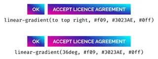
linear-gradient(#f09, #3023AE, #0ff)
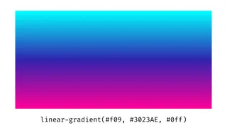
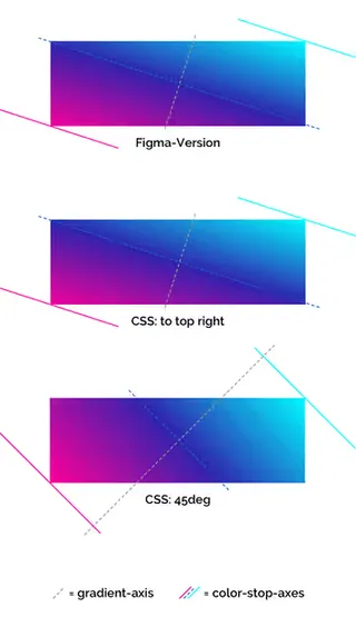
If only colors are specified, the gradient runs from top to bottom. This can be changed, for example, by putting to top right as the direction in front of the color values:
linear-gradient(to top right, #f09, #3023AE, #0ff)
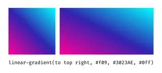
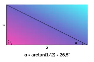
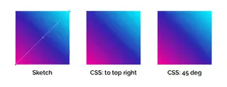
Now the gradient runs from the lower-left corner of the element to the upper right corner. The angle of the gradient is determined by the size of the element. For a square, this results in an angle of precisely 45 degrees. If the aspect ratio of the element changes, the gradient's angle is adjusted to the angle of the diagonal. For example, an aspect ratio of 2:1 results in an angle of approximately 26.5 degrees.
Since the angle here depends on the width of the element, you should be careful when defining a gradient for a button, for example. Different widths can easily result in a non-homogeneous look. Especially if you want the gradient to be parallel to some other line in your design.

Specification of exact angles
In addition to the direction from a side or a corner, it is also possible to specify an exact angle. This happens at the same place where we indicated the direction before:
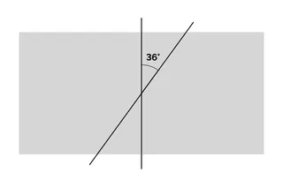
linear-gradient(36deg, #f09, #3023AE, #0ff)
What happens now can best be described as follows:
Draw a gradient at an angle of 36 degrees, but make sure that all the colors indicated are visible.
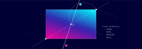
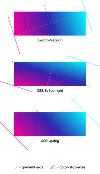
I try to explain step by step what this means: First, we draw a vertical axis and rotate it by 36 degrees. Let's call this one the gradient-axis.
Next, we draw the diagonal of the rectangle closest to the gradient-axis. In our case, this is the diagonal line from the bottom left to the top right. On this diagonal, we place the given color points – Pink at 0%, purple at 50%, and cyan at 100%.
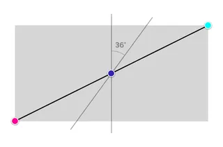
We're almost there now. Only three lines are missing, which run through the given color points and are orthogonal to the gradient-axis. I will refer to them as color-stop-axes (Watch out: The lines are not orthogonal to the rectangle's diagonal!)
At the intersection of the two outer color-stop-axes with the gradient-axis are now the gradient's start- and end-points.
Finally, the gradient can be painted. And we can see that it runs exactly at the specified angle, and yet a small part of the colors defined at 0 and 100 can be seen on the outer edges.
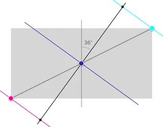
If you are a fan of geometry, you may have seen that the diagonal, the gradient-axis, and the outer color-stop-axis form a right-angled triangle. Applying the theorem of Thales, we can draw a circle around this triangle. And if we repeat the whole procedure at the remaining three corners, we get a figure that reminds a little bit of a flower. When the gradient is rotated, its endpoints run along the outer line of this flower shape. Pretty cool, right??

Now let's look at the buttons again. First the version from above and for comparison, the same buttons with a fixed angle. It’s only a subtle difference, but in the end, it’s often the little things that matter.
Interactive example
OK, that was all very mathematical. And you probably also wondered why you need trigonometry when you just want to insert a gradient. To visualize this a bit better, I created an interactive demo on CodePen.
See the Pen Gradient angles in CSS by Nils Binder (@enbee81) on CodePen.
II. Gradients in Sketch
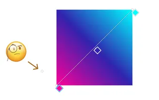
Now, what does it look like when we try to recreate the same process in Sketch? First of all, you have to deal with the fact that it is not possible to specify an exact angle for a gradient in Sketch. So let's start with a square and drag a gradient from one corner to the other. This way we know for sure that it has an angle of 45 degrees. Fortunately, smart alignment works here, so it's pretty easy to hit the exact corner.
The result is a gradient that can be recreated with CSS in two ways. Either via to top right or via 45deg.
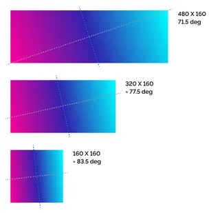
Now it gets very interesting when we stretch the square to three times its width and compare the result with the respective CSS declarations:
I don’t want to bore you too much with math.
The important thing here is that neither of the two CSS options behave as they do in Sketch. The gradient in Sketch has an angle of about 71.5 degrees (If you're genuinely interested: this is the arc tangent of 3/1 ). In the to-top-right version, the angle is about 18.5 degrees (that is 90 - 71.5 or arc tangent of 1/3).
In Sketch, the gradient-axis stays on the diagonal, whereas in CSS, the gradient-axis is adjusted so that the color-stop-axes are parallel to the opposing diagonal.
Finally, in the 45deg version, we have an angle of (surprise) 45 degrees. If you wanted to reproduce this gradient in Sketch, you need to place the gradient's endpoints at the intersections of gradient-axis and color-stop-axis. This only works as long as you do not resize the object again.
III. Gradients in Figma
Finally, let’s have a look at how things look like in Figma. Again, we start with a square and draw a gradient from one corner to the other.
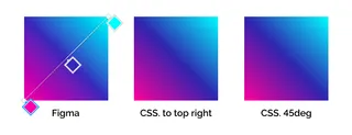
And also in this case we enlarge the square to three times its width to be able to compare the result with the two CSS versions.
In fact, it looks like Figma behaves exactly like the to top right CSS version. At least that's what it looks like in the current example. Unfortunately this is not always true. Figma takes the created gradient as if it was a pixel graphic and distorts it. Thus the angle of the gradient also changes. This becomes clear if we start with a 3:1 rectangle, fill it with a gradient and then reduce it to a square.
The changed angle is shown in Figma by a small dot that can easily be overlooked. If you want to change this angle, you have to move this point while holding down the option-key. Unfortunately I don't know why the distance can be changed as well.
IV. Conclusion
We can see that it is almost impossible to reproduce the behavior of CSS with Figma or Sketch (At least with gradients whose angle is not a multiple of 90). The only thing that can be recreated in Figma is a gradient from one corner to the other. But again, you have to make sure that you first create a square, fill it with the gradient and then distort the square to the desired size.
So next time before you blindly copy the given CSS properties into your code, better check if the result really looks like you imagined it. And while you're at it, take a look at the color stops as well and check if they are positioned correctly or if you can do without the percentage values completely.

