Live is beautiful.

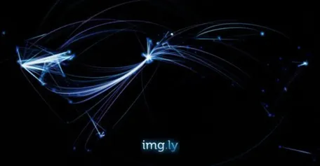
At Nodecamp 2011, we wanted to present a live tracker built with Node.js. After seeing the popular facebook map by Paul Butler, I was wondering why not create something like that with live data.
The appeal of watching the temporal dynamics within such a visualisation is obvious.
Of course, the problem with live data is that there is no way to tweak it with some nice afterfx, or play it in fast forward to make it look awesome. Mastering the art of live visualisation requires to create something meaningful while it looks stunning at almost every single instant. That’s not easy.
After giving the idea some thought, I decided to go with data from img.ly. Img.ly is one of our projects which has shown some serious traffic lately, mainly because img.ly became the default image service of the popular twitter client Twitterrific. Needless to say the guys from Twitterrific deserve some serious credit, not only for creating awesome apps, but also for supporting other services without asking anything in return. After some years in this business I can tell you: this is more than unusual.
The idea
We still had to figure out what exactly to visualise. There are already many apps plotting visitors on a map, so obviously this was not very interesting. We were interested in connections, and basically there is already a very important type of connection on img.ly. Whenever you call a picture on img.ly, you create a connection to the user who posted it. We can apply this idea to location, thus all we had to do was to connect the location of visitors with the location of the picture they’re viewing. That’s the idea.
The technical setup - Backend
As mentioned before, we wanted to do something realtime. Sascha (@rattazong) therefore made an awesome setup for the backend. When someone views the experiment, a persistent connect to a Node.js server is established using socket.io. If another person views an image on img.ly we send a message to the server with two parameters: The location of the image that has been viewed and the location of the viewer. Inside the server we’re accumulating these views in a datastructure and then propagating the information to all clients. The heavy lifting is done by the in-memory database Redis. The locations are determined using the geoip package for Node.js. If the node process crashes, it’s automatically restarted with forever. Deploying is done with capistrano using this recipe.
The technical setup - Frontend
We considered different rendering techniques which could draw such a large amount of data on the screen. I decided to go with canvas, since I wanted to use procedural drawing instead of drawing every pixel of canvas on each frame. That turned out to be a wise decision.
I was able to “exploit” three features of the canvas API:
You can apply a shadowBlur attribute to your canvas to make it glow. I was playing with a custom gaussian blur before, but it was far to expensive in terms of CPU performance. The shadowBlur was a nice workaround, it creates the “lazoresque” appearance in the visualisation.
You can use use different blending modes in HTML, and by successively applying the “lighter” and “source-over” option you can generate both a heatmap and a decay over time. Effects 1 & 2 combined produce quite a stunning visual.
You can draw curves with the drawBezier function. Of course it’s not that simple in my case. I had to calculate segments of a Bezier curves, there is a nice explanation how it works on wiki. A tiny segment of the curve is drawn and moving forward every frame. By applying the “lighter” blending mode, overlapping segments created a lighter color and consequently I was able to produce the gradient effect on the curve. Getting there took quite some time though.

Mapping the data
Fine-tuning the visualization was the most time-consuming and probably most important part of the project. If it doesn’t look sexy, nobody will watch it. There are many parameters to tweak and it’s been very time consuming to find out the best configuration.
Let’s sum up the most important decisions which made a deep impact into the visual:
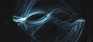
The distance between both endpoints of the curve determines the bending and the opacity of the curve. The further two points are away, the more the curve bends. This significantly decreased collision between curves. Furthermore, the curves are directional, which means that a curve connecting Berlin with New York will bend up, while the opposite direction will produce a curve bending down. This is a simple way to give us more information about the connectivity: e.g. you can see with one glance that Europe drives more traffic to the US than the other way around.
Creating patterns
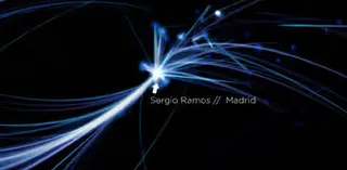
While working on this project I was lucky to see many interesting findings. For example, at one point popular football player Sergio Ramos (>1million followers) posted a picture, and suddenly all Spanish speaking countries on this world turned their attention to it:

You can see this pattern whenever some popular twitter user posts a picture on img.ly.
During the riots in Syria something similar happened, after a Syrian posted a related picture on img.ly. It was far less dramatic than the Sergio Ramos effect - however the visualization showed a gradual incline of views. Even the propagation of this image across the world became visible.
Some other facts:
There are more people in Europe ‘connecting’ to the States than the other way around.
Tokio never sleeps.
img.ly used to be among the top Alexa 500 websites in china. Now we’re blocked by the great Chinese firewall.
Far less Mac traffic in the industrial states than expected.
Spotting Neil Patrick Harris’s picture on img.ly was legen…wait for it… dary!
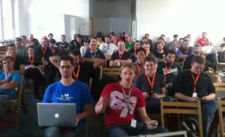
Never show a live demo when there is no internet, and the room too bright to beam a decent visual ;)

