Sizing Blocks or Areas using CSS Custom-Properties
One of the many challenges when it comes to writing CSS is choosing the right unit. Over the years there has been a lot of controversies whether to use px, em or rem to size text. So I thought, why not add some custom properties to this mixture and see where it leads us. To not overcomplicate things and quickly get to the point, I will first describe my current approach when it comes to handling font-sizes. In part two, I will sprinkle in some custom properties.
Part I: My Current Approach (without custom properties)
TL/DR: Percentages at the Root, rem for Components, em for everything else (yes everything!).
My current approach is very similar to the ones described by Robin Rendle, Chris Coyer, and Richard Rutter. I strongly prefer relative units over pixels. So in my CSS-Files, you will find something like this mostly all of the time:
csshtml {
  font-size: 100%;
}
.headline {
  font-size: 2em;
}
A little reminder: 1em is relative to the font size of the element. 1rem refers to the root font size (HTML) which is mostly set to 16px as a default. In fact, I’d love to hear if there is a browser these days that does not use 16px as the default font-size.
I have to admit, I try to define nearly everything with em, whether it is font-size, margin, padding, width, height or even things like box-shadow. The main reason is, I don’t want to end up with something like this:
I know, working solely with em can get a little messy, as everything is calculated using the font-size of its parent element as its basis. And once you are like three levels deep, you tend not to know what precisely that basis is.
Reset at the top
To make things a little easier I do a reset, whenever I start building a new block. (If you are more of a React developer, simply think of components instead of blocks, or maybe module is the right word for you? 😀) I set the font size to 1rem so it uses the root font-size as its basis and ignores whatever font-size was set on the parent. From there I go on using em. My CSS (in fact its SCSS, that’s what I’m used to writing) looks something like this:
css.teaser {
  font-size: 1rem;   // this is where the reset is happening.
  margin: 0 0 1.5em; // from here on use em again
  ...
}
.teaser__headline {
  font-size: 2em;
  ...
}
.teaser__body {
  font-size: 0.875em;
  ...
}
I know working with em and rem instead of px is still a little uncomfortable for some people. To make it easier, you can rely on calc and write something like: font-size: calc(32em / 16), or you can use one of the many SASS mixins to make the calculations for you.
Why should I do that?
Getting rid of all your pixel-declarations has significant advantages:
Modify the size of your component
You can resize your component by adding a modifier that changes the font size on the block level ( e.g.,font-size: 0.875rem). In the Codepen below there are two modifier-classes applied (teaser--small&teaser--tiny) that change the font-size and you can see that the whole teaser scales down.Resize the whole website
But you don’t have to stop here. What I like most about all this and also used in nearly all of the projects I’ve been working on lately, is that you can scale your whole website by merely changing the font-size of the HTML element. Let’s say you want to optimize your website for large screens. Just add a media query, blow up your font size to 125% and watch your website scale up. Wooooooow.
css@media screen and (min-width: 75em) {
  html {
    font-size: 125%;
  }
}
See the Pen rem-em-sizing by Nils Binder (@enbee81) on CodePen.
See both features in action. Teasers with modifier classes and dynamically change the font size of the HTML element.
If you want to see this in action, have a look at one of these Websites and resize your browser to something wider than 1440px.
TEV - More than an investor. Your partner.
RuhrJS Conference 2019
Challenges with nested Blocks
Because there is a reset at the beginning of every block, things get a little complicated, when you have nested blocks. You can apply a modifier (e.g., font-size: 1.25rem) to a parent block, but the font-size is reduced to 1rem within the nested block, so it appears smaller in relation to the parent. If you want to change the child-blocks as well, you’d have to apply modifiers to every child 😞. As a solution to this problem, you can use a custom property instead of solely relying on rem. Let’s see how this works.
Part II: Add a Custom Property
Instead of doing a reset by setting font-size to 1rem, you can also use a custom property. Our CSS will change to this:
css:root {
--fs: 1rem;
}
html {
font-size: 100%;
}
.teaser {
font-size: var(--fs);
.
.
}
.button {
font-size: var(--fs);
.
.
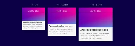
}Not much has changed so far. The custom property --fs is used as a variable (like a variable known from preprocessors like Sass), and its value is placed as a reset-value for font-size on the block level. It gets really interesting, once you change the value of the custom property. Let’s say we use a modifier class and increase the font-size:
css.teaser--small {
  --fs: 1.25rem;
}
Because the variable’s value cascades down, also nested blocks are affected by it, and the whole component including its sub-components scale up evenly.
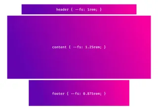
It is also possible, to change the size of whole areas (e.g. Content, Footer, Sidebar) at different viewport sizes. Maybe for a blog layout where you want a bigger content to achieve better readability, but want your header and footer to stay as they were. And still, you have the possibility to change the root font-size and the whole page will scale up or down but maintain the ratio between different areas.
Have fun trying it out.
I created a Codepen where you can play around with the root font-size and also resize two areas (content and sidebar) by adjusting a custom property.
Final words
With the rise of new CSS Layouting methods like Flexbox and CSS-Grid, we finally have the tools to create art directed layouts, that don’t have to look like the standard bootstrap layouts we saw quite a lot over the last years. Still, it is a huge challenge to build appealing layouts for all the different screen sizes. I hope the ability to dynamically resize individual areas can be another building block in creating innovative and exciting web experiences.
Further Reading on Custom Properties
Mike Riethmuller: It’s Time To Start Using CSS Custom Properties
Serg Hospodarets: A Strategy Guide To CSS Custom Properties
Robin Rendle: Using Custom Properties to Modify Components
Further Readion on relative Sizing
Andy Bell: Relative sizing with EM units
Robin Rendle: Use rem for Global Sizing; Use em for Local Sizing
Richard Rutter: Use rems for global sizing, use ems for local sizing

