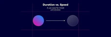
Speed vs. Duration - A use case for mixed unit division
Animating elements in CSS can be challenging, especially when you want to ensure smooth transitions across different screen sizes. One issue that I stumble upon quite often is the inability to divide two length values in CSS. For example, calc(100vw / 1px) isn't valid. While we can adjust length values based on the viewport width, such as using clamp(1rem, 0.818rem + 0.91vw, 1.5rem) for font sizes, this approach doesn't work for other value types like <angle> or <time> because they do not accept length values. If you want to use other unit types that depend on the viewport width, you need to strip away the unit and have it as a <number> type.
Until recently, I thought we needed JavaScript to get the viewport width as a unitless number. But then I watched Matthias Ott's fantastic talk at this year’s CSS Day conference. He mentioned a post by Jane Ori, where she explains a clever technique. She combines atan2() with tan() to get a <number> value for the viewport width. Although atan2 can be buggy, as she explains, it works well enough for a quick demo to show where these values could be useful.
Note: I highly recommend reading Jane's article for a deeper understanding. But for now, don't worry too much about the math involved. The key takeaway is that tan(atan2(y, x)) will give us the value of x/y without any units. We'll use this to obtain the viewport width in pixels but as a
The duration dilemma
When you animate elements with CSS, you usually set a fixed duration for the animation. This works well if you know the exact distance the element will move. However, if you don't know the distance the speed of the element changes. For example, if you want to animate an element from the left side of the screen to the right, the duration remains constant, but the element's speed varies depending on the viewport width. On small screens, the element moves much slower than on larger screens.
See the Pen duration vs. speed | 01 by Nils Binder (@enbee81) on CodePen.
Duration based on screen-size
Sure, you could adapt the duration using media queries to make it look nicer. But this requires creating many steps, causing the animation to jump from one duration to another. It feels like adaptive design limited to specific screen sizes. It would be much easier if we could tie the duration directly to the viewport width.
Let’s do this with the technique described by Jane Ori:
First, we need to register a property with a <length> syntax. We'll call it --100vw since it will be set to 100vw. This step might seem unnecessary because we're essentially storing the value 100vw in a variable named --100vw. However, it is necessary due to the current implementation quirks when atan2 is used with two different length units.
css@property --100vw {
  syntax: "<length>";
  initial-value: 0px;
  inherits: true;
}
With this in place, we can define three custom properties in the root:
set the
--100vwto 100vw,use the tangent and arctangent combination to calculate the unitless pixel width
calculate the duration based on the px-width
css:root {
  --100vw: 100vw;
  --px-width: tan(atan2(var(--100vw), 1px));
  --duration: calc(var(--px-width) / 1000 * 2s);
}
In this example, --px-width is divided by 1000 and then multiplied by 2s. For a screen width of 1000px, this results in a duration of 2s. On a screen width of 500px, it results in a duration of 1s.
See the Pen duration vs. speed | 02 by Nils Binder (@enbee81) on CodePen.
You can see that instead of defining the duration, we now define the speed of the object. This ensures the animation speed is consistent across screen sizes. On larger screens, it takes a bit longer for the circle to move from one side to the other compared to smaller screens.
Advanced example
Here's another example where the unitless width is used in another animation, and the result is used in a sin() function to create a bird flying in a wavy line across the screen. You can also play with the duration and the wave frequency:
See the Pen Bird with controlled speed by Nils Binder (@enbee81) on CodePen.
Is this a hack? Should I use this in production?
When complex CSS is involved, it's easy to label it as a hack. However, I believe that a true CSS hack implies exploiting quirks or inconsistencies in how different browsers render CSS. The techniques used in this post utilize CSS that functions as intended, so I wouldn't classify them as hacks.
As for using these techniques in production, be aware that registered custom properties are not yet supported in Firefox at the time of writing. Support is expected in the next version (128), so consider using this approach as a progressive enhancement.
I'm also very interested in seeing other use cases, so please tag me or 9elements if you experiment with similar techniques.

