The Devil's Albatross

An algorithmic layout technique
I'm fascinated with the concept of algorithmic layouts and got so used to building whole websites without using any media-query, that I sometimes forget they exist. (You got no idea what an algorithmic layout is? Long story short: It's a component that uses some clever CSS hacks to mimic the behavior of container queries. If you want to learn more about it, I highly recommend the work of Heydon Pickering. And you should be prepared – his name will pop up quite often during this little post.)
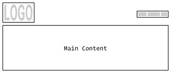
I've built many simple websites that contain only a handful of sub-pages. And I found that there was one particular design element that appeared on nearly every single one of them. I'm talking about the header section with a logo placed in the upper left corner and the navigation in the upper right corner. I wanted to build this component without having to use a media-query.

Building this looks simple at first. You can use flexbox and then justify the content so that both elements are pushed to the corners (justify-content: space-between does the trick here).
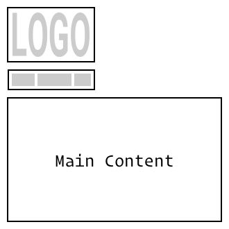
But what happens on smaller screens? (I would advise not to use a burger menu for simple websites. If there are only five sub-pages, it would be quite sad to hide the links from the user's view.) Let's stack both elements on top of each other. When adding flex-wrap: wrap to the parent element, the navigation jumps under the logo whenever there is not enough space for both of them.

Sometimes this may be all you need to do. But what if you want to have everything centered once it wraps into two lines? Here it gets a little tricky. Probably the easiest way to center block elements is to set margin-left and margin-right to auto. This looks nice on smaller screens, but returning to the adjacent layout, we see that each element is centered in its own half of the container, which looks odd.

Introducing the Devil's Albatross
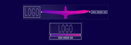
What we need is the Devil's Albatross. Why is it named like that? I'm glad you asked. First, the albatross is an absurdly large bird with a wingspan of up to 3.5 m (11.5 ft) – and you will soon see that something absurdly large is precisely what we need. And you remember that I pointed you to Mr. Pickering before? Well, he came up with an ingenious layout technique and called it The Flexbox Holy Albatross.
Fine, but what about the Devil part? Well, there is another layout technique called Flexbox-999 Hack. And again, Heydon Pickering plays a key role here. In his Video Series Making Future Interfaces, he uses a value of 666 instead of 999 because 'he is a satanist.'
When we combine both techniques, we get a satanic bird and that's why I called the whole thing 'Devil's Albatross'.
What exactly does this bird do?
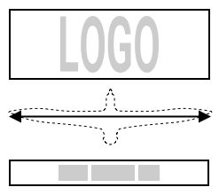
So we have a fancy name, but what does this bird do? Think of the albatross as an element that sits between the logo and the navigation. Since it is an absurdly large bird, it takes up a lot of space and pushes the other elements to the edges.

If you force the bird to get smaller and smaller, eventually, it won't be able to take it anymore and will first get angry and then grow so much that it takes up as much space as it possibly can. As the adjacent elements are in the way, it wraps to a new line and fills it.

Now let's build this with CSS
Before we can work some CSS-Magic, we need our HTML structure. Inside of a container there are three elements. A <div> containing the logo-image, then the albatross itself and finally a <nav>-element for the navigation.
html<div class="container">
  <div class="logo">
    <svg viewBox="0 0 232 40" width="232">
      <path d="M10.8 39V18.8L17.2 33H23l6.4-14.2V39h10.5V.7H28.4l-8.3 18-8.3-18H.3V39h10.5zm55.5 0V26.3L79.5.7H68.1l-7 16.5L54 .7H42.9l13 25.5V39h10.5zm44 0v-9.2H92.9V.7H82.4V39h27.9zm20.5.3a18.9 18.9 0 0014-5.9 19.7 19.7 0 005.5-13.4A19.5 19.5 0 00145 6.5a18.4 18.4 0 00-14-6.1 19.2 19.2 0 00-14 5.9 19.4 19.4 0 00-.3 27 18.4 18.4 0 0014 6zm0-9.3a8.2 8.2 0 01-6.6-3.1c-.7-1-1.2-2-1.6-3.3a13 13 0 010-7.4c.3-1.2.9-2.3 1.6-3.3a8 8 0 016.6-3.1c1.5 0 2.8.3 3.9.8 1 .6 2 1.3 2.7 2.2.8 1 1.3 2 1.7 3.2a13 13 0 01-1.6 10.8A8 8 0 01131 30zm40.6 9.3c3.5 0 6.7-1.2 9.4-3.5V39h8.7V18.6h-15.8V26h6.7c-2.4 2.6-5 3.8-8.1 3.8a8 8 0 01-6.4-2.8c-.8-.8-1.4-1.9-1.8-3.1-.5-1.2-.7-2.6-.7-4.1 0-1.5.2-2.9.7-4a10 10 0 011.8-3.3 7.8 7.8 0 016.2-2.9c1.6 0 3.2.5 4.7 1.4 1.5 1 2.7 2.1 3.4 3.7l7.9-6c-.7-1.3-1.6-2.5-2.7-3.5a17.3 17.3 0 00-8-4.3 21.3 21.3 0 00-12.8.9 18.7 18.7 0 00-12 17.6c.1 3.1.6 6 1.6 8.4 1 2.4 2.4 4.5 4.1 6.2a17 17 0 006 3.8c2.2 1 4.6 1.4 7 1.4zm40.6 0a18.9 18.9 0 0014-5.9 19.7 19.7 0 005.5-13.4 19.5 19.5 0 00-5.3-13.5 18.4 18.4 0 00-14-6.1 19.2 19.2 0 00-14 5.9 19.4 19.4 0 00-.3 27 18.4 18.4 0 0014 6zm0-9.3a8.2 8.2 0 01-6.6-3.1c-.7-1-1.2-2-1.6-3.3a13 13 0 010-7.4c.3-1.2.9-2.3 1.6-3.3a8 8 0 016.6-3.1c1.5 0 2.8.3 3.9.8 1 .6 2 1.3 2.7 2.2.8 1 1.3 2 1.7 3.2a13 13 0 01-1.5 10.8A8 8 0 01212 30z" fill="#F09" fill-rule="nonzero"/>
    </svg>
  </div>

  <div class="devils-albatross"></div>

  <nav>
    <ul>
      <li>Partners</li>
      <li>About</li>
      <li>Source</li>
      <li>Contact</li>
    </ul>
  </nav>
</div>
It gets much more interesting, when we take a look at the CSS part.
css.container {
  display: flex;
  flex-wrap: wrap;

  /* This centers the two elements vertically
  when they are adjacent to each other. */
  align-items: center;
}

/* Target all direct child elements and allow them to grow */
.container > * {
  flex-grow: 1;
}

.devils-albatross {
  flex-grow: 666;

  /* Substract 100% from a chosen threshold */
  flex-basis: calc((38rem - 100%) * 666);
}
We need to give the container a display value of flex and allow the elements to wrap by using flex-wrap: wrap. Because we want our child elements to always fill the whole available space, we add a flex-grow: 1 to all children of our container.
Finally, the Albatross itself: First, it has a flex-grow value that is quite large. When all elements are aligned next to each other, it will take up all the available space. Remember, its enormous wingspan.
For the flex-basis, we do a little calculation. You might want to sit down for this one: The container's width (100%) gets subtracted from a chosen threshold (in this case, I choose 38rem) – the result is then multiplied by 666. As long as the container is wider than the threshold, this results in a large negative value. When using a negative value as flex-basis, it is treated as if it was 0. – As soon as 100% is smaller than the threshold, the calculation's result will be very high. This high value forces the element into the next line since it now has a very high basis.
When the Albatross jumps to a new line, the logo and navigation can finally breathe and grow to the container's full width (remember all children have a flex-grow: 1 applied), making it possible to center their children horizontally. Here it is up to you, what you use. Could be anything from a simple text-align: center to another flex container that has justify-content: center applied.
Let's exorcise the devil and use a pseudo element instead.
Using an empty <div> for the Devil's Albatross doesn't feel perfect to me. After all, the Devil doesn't exist, so it should not be visible, right? Instead of having a dedicated DOM element, we can use a pseudo-element instead and apply the needed CSS-rules. But how do we push a before-element to the middle of the row? Well, we don't. Instead, we change the order for the :first-child (the logo) and drag it to the row's start.
css.container {
  display: flex;
  flex-wrap: wrap;
  align-items: center;
}

/* This is where the Albatross Magic is happening now */
.container:before {
  content: "";
  flex-grow: 666;
  flex-basis: calc((38rem - 100%) * 666);
}

.container > * {
  flex-grow: 1;
}

/* Drag the first child to the beginning, so that the pseudo
element moves to the center */
.container > *:first-child {
  order: -1;
}
Individually adjust threshold and margin
CSS variables make it possible to customize the threshold and vertical spacing between the two elements. As long as the gap property is not yet supported in Safari, we have to use margins for the gap, which are then subtracted from the outer container using a negative margin.
Here is a working demo of the full version. I have chosen centerflex as the utility-class-name for the container here. I think writing "devils-albatross" every time could be a bit confusing. If you have ideas for a better name, feel free to write me.
See the Pen flex 666 albatross aka devil's albatross by Nils Binder (@enbee81) on CodePen.
Further Reading
- Every Layout by Heydon Pickering and Andy Bell shows you a lot of algorithmic Layout examples
- Making Future Interfaces Playlist by Heydon Pickering on YouTube
- The Fab Four technique by Rémi Parmentier
- Everything You Know About Web Design Just Changed Talk by Jen Simmons where she explains her concept of intrinsic layouts
