Create Diagonal Layouts Like It's 2020

TL/DR: Diagonal layouts are great. You can build them easily with CSS. Take a look at this CodePen to see how it works.
Layouts with diagonal sections are quite popular for several years now. It is not the new hot stuff, and you will probably not find it in the articles titled "Design trends for 2020". But I think it is here to stay. It is one tool designers can use to bring some dynamic to all the rectangular boxes with boring 90-degree angles.
Because of this, it is essential for frontend designers to know how to implement these designs with CSS. So if you want to learn how to do this, you've come to the right place.
As so often, there is nothing like a holy grail. There are many ways to build these kind of layouts. And with many, I mean three. At least three that I know of:
Use an SVG in the form of a triangle. This technique is nicely described by Erik Kennedy on CSS-Tricks.
Hide part of your section using CSS-Clip-Path. Read Diagonal Containers in CSS by Sebastiano Guerriero or Sloped edges with consistent angle in CSS by Kilian Valkhof.
Using CSS-Transforms.
You may already have guessed, which of the given options I'm going to use. Right, the third one :-)
So let's start
I. Basic Markup
First, we will set up our HTML Markup. It basically consists of two containers.
html<div class="diagonal-box">
	<div class="content"> ... </div>
</div>
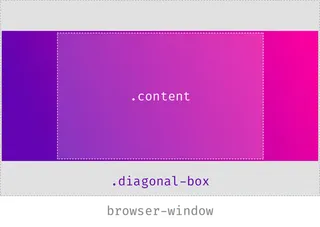
The outer div is our full-width section, whereas the inner one will hold the actual content. Typically you will have a max-width for the inner div and give it a horizontal margin of auto to center it. For now, the outer container gets nothing more than a nice little gradient as background-image.
css.diagonal-box {
	background-image: linear-gradient(45deg, #6303B1, #ff0099);
}
.content {
	max-width: 50em;
    margin: 0 auto;
}
II. Do the transform
The first idea for creating the diagonals could be to rotate the whole container. The problem here is that after rotating the 100%-width-box, you have to increase the width above 100% so that it still covers the entire viewport. The amount of how much you have to increase the width grows with the height of the section.
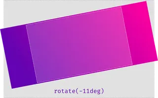
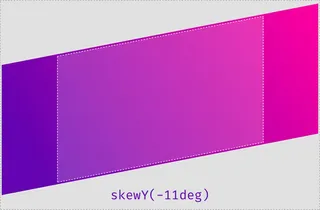
So instead of rotating it, we will use the lesser known skew-transformation. More precisely, we will use SkewY to skew the section along the Y-Axis.
css.diagonal-box {
  background-image: linear-gradient(45deg, #6303B1, #ff0099);
  transform: skewY(-11deg);
}
III. Inner and outer transformation
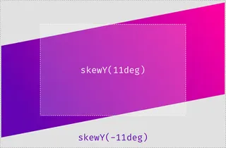
You may have noticed that now the whole section is transformed, and with it also the content-div living in it. Even though this effect can be quite lovely, sometimes you don't want the content to inherit the given transformation. To reset everything back to normal, you have to reverse the transition:
css.diagonal-box {
	background-image: linear-gradient(45deg, #654ea3, #eaafc8);
	transform: skewY(-11deg);
}

.content {
	max-width: 50em;
	margin: 0 auto;
	transform: skewY(11deg);
}
IV. Use a Pseudo-Element
If you want to have some other transitions on the inner element (i.e., some fade-in animation), you always have to think about adding the re-transform first. Other transformations will be stacked on top of the first one. This can get a little bit daunting. Thankfully there is a solution to the problem: Instead of transforming the whole container, you can add a pseudo-element to it with the same dimensions and then skew this. Our Code will look like this:
css.diagonal-box {
 	position: relative;
}

.diagonal-box:before {
	position: absolute;
    top: 0;
    right: 0;
    left: 0;
    bottom: 0;
    background-image: linear-gradient(45deg, #654ea3, #eaafc8);
    transform: skewY(-11deg);
}

.content {
	max-width: 50em;
    margin: 0 auto;
    position: relative;
}
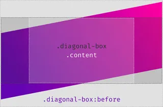
Now all the magic happens in the before-element. Because it is positioned using position-absolute, you need to add two position-relative values. The first one to the outer container, so all its children can be positioned relative to its borders. And the other one to the inner container, so it stays on top of the before-element.
V. Place your content without fear.
You may have noticed that now the content is not entirely enclosed by the surrounding container. If you want to place something in the container without being scared that it will cross the diagonal lines, you need a little padding. One way to find the right amount of padding that works for you is to use some trial and error method. Or you dig very deep in your knowledge of trigonometry and calculate the exact height:
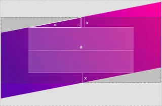
When you look at the illustration, you can see that we already know the width of a, as it is our container-width. Then α is the same angle we used to skew our element (11deg). And we know that everything forms a right-angled triangle. With this information we can calculate x using this formula:
x = tan(α) * a / 2
Sadly we can not use this with CSS calculations as the tangent function is not supported. It is not a huge problem though. Most of the time, the angle will stay the same, so you can calculate it once and then store it. Still, there is one point where you have to be careful: Most of you will use degrees as unit when you do the transformation: skewY(-11deg). If you do so, you also have to use Deg and not Rad when you calculate tangent. The standard google calculator uses Rad as default.
Update 2023: Using tan() in CSS
Since the publication of this article in 2020, there have been some
updates in CSS that allow us to use the tangent function. This means
that we can now calculate diagonal layouts in CSS without the need for
complex workarounds. The tan() function takes an angle as an
argument and returns the tangent of that angle. To learn more about
using the tan() function in CSS, check out the documentation on Mozilla
Developer Network. You can also view an updated CodePen demo that
showcases the use of tan() in CSS.
VI. Fun with Custom-Properties
The numbers you get from the tan-calculation don't look that nice. In this example tan(11°) / 2 results in 0.09719. Fortunately, we can use Custom Properties and make our code a lot easier to read:
css:root {
	--magic-number: 0.09719; /* tan(11°)/2 */
	--content-width: 100vw;
	--skew-padding: calc(var(--content-width) * var(--magic-number));
}

@media screen and (min-width: 42em) {
	:root {
		--content-width: 42em;
	}
}
Let's see what's happening here. First, we calculate our magic number and store it in a variable. Then we also store the content-width. Finally, we calculate the required padding by multiplying the previous two variables and also save the value in a variable. Because CSS-Variables are live-updated, we can change the --content-width, and the --skew-padding will adjust accordingly.
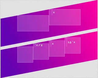
Now that you have the distance stored in a variable, you can use it anywhere in your project. For example, you could arrange some boxes so that they are aligned with the diagonals. Depending on the number of boxes, you need to use some calculations. Like:transform: translateY(calc(var(--skew-padding) / 2));

Have fun playing around
Here you can see a working example. The values for the magic number are updated using JavaScript, the rest is pure CSS.
See the Pen Diagonal Layouts in 2020 by Nils Binder (@enbee81) on CodePen.
And if you need a helping hand with complex layouts or your digital projects - leave us a message we're open for business.
